Inside Arena: Four Design Principles for a Better User Experience
![]()
Contrast. Balance. Emphasis. Repetition. These are the four design principles of our
user interface (UI) refresh and
user experience (UX). Are you curious about why Arena chose these four principles and how each is implemented in our latest release? We were.
Jannelle Jansen, Arena UI Designer, and Antony John, Arena Director of Product Management, sat down with me to share the thinking behind Arena’s design principles and the benefits to Arena users.
Ann: Why is now the time for a refresh at Arena?
Antony: Today, industries are more distributed and digital than ever—think about Digital Transformation and
Quality 4.0 initiatives. So, companies need ways to facilitate global communication and collaboration.
Our customers have cross-functional teams working together to bring products to market. And, those teams pull from more departments today: from traditional Arena users like Engineering, Operations, and Quality to Human Resources, Compliance, Field Service, and more partners. Interactions with Arena need to be both efficient for power users and familiar for casual users.
As a critical enterprise system, Arena has staying power. We have customers who’ve been with us since almost the beginning of Arena as a company and product 20 years ago. Technologies and user expectations have continued to change. Throughout the years, we’ve focused on evolving Arena for our customers, implementing ways to improve clarity, focus, and consistency. This latest release is part of that evolution, bringing our UI to current standards and guidelines. Our updated UI more closely aligns with ubiquitous experiences in modern applications.
Jannelle: At Arena, we pride ourselves on helping customers deliver their own great products. Our new team-friendly design makes it easier for users do just that.
Since the last UI redesign at Arena, the design world has developed new design principles based on studies that help us understand how users interact with enterprise software. The timing feels right. The last three to four releases focused on developing advanced and expanded functionality. Now, we’ve reinvested in our UI design. You can find this trend of focusing on the UI throughout the enterprise software world. For our customers, this release means less user training so you can spend more time on high-value activities.
Contrast
Definition: Creates space and difference between elements in the design.
Ann: Why is contrast important?
Antony: Contrast is an important element in enterprise applications like Arena because it helps provide clarity. Clarity can be a challenge when you’re working with lots of complex information. Contrast helps users distinguish between the different elements on the screen. For example, the header information should be easy to distinguish from data or actions.
And, we took advantage of our move to the standard white-based background. The white background can be bright, so we added contrasting colors to help you see the information more clearly without overwhelming your eyes.
Jannelle: We thought beyond improving the look of the UI. We created separations on a page to help users find what they need faster. Contrast improves readability and lowers eye strain. The goal is to make information clear to see with less eye strain. The contrast will evolve over time as users provide feedback.
Ann: How did you accomplish this contrast goal?
Jannelle: We used negative and positive space concepts. Negative is empty white space; positive space draws your eyes to those specific elements on the page. We use shades of colors so reading is easier on the eyes.
Antony: A good design calls for refinement through iterations and that’s what we did. Multiple iterations and customer reviews helped us learn how different eyes perceived the contrast options. Using this information, we assigned different shades of text and colors into the application.

Balance
Definition: Considering the relative weight of elements on a page and their relation to each other
Ann: Why balance?
Antony: Balance has always been a critical aspect for Arena to help users focus on the most important elements on the page. In past releases, the different shades of color contributed to that balance. When we talk about balance, we give every element on the page a priority and a corresponding weight through typography, colors, images, and patterns. Each element has a purpose on the page. Users will see all the elements on the screen, starting with the most important. We used information mapping to determine the importance of each element. Heavier elements are the first you’ll notice while lighter elements are there when you look for them.
Jannelle: We need balance to make the UX flow efficiently. Balance facilitates the user’s ability to scan a page to focus on what is needed. The goal is to help users spend less time accomplishing tasks.
Ann: How did you improve balance in Arena design?
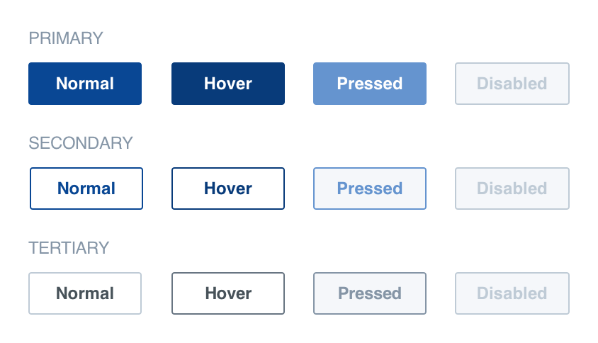
Antony: We reviewed our design for importance and weight along with our color combinations. We adjusted each one to create balance on every page in the application. For example, the primary workspace color is carried to the three levels of buttons: primary, secondary, and tertiary. The primary button has the darkest color, balanced with lighter shades for the secondary and tertiary buttons.
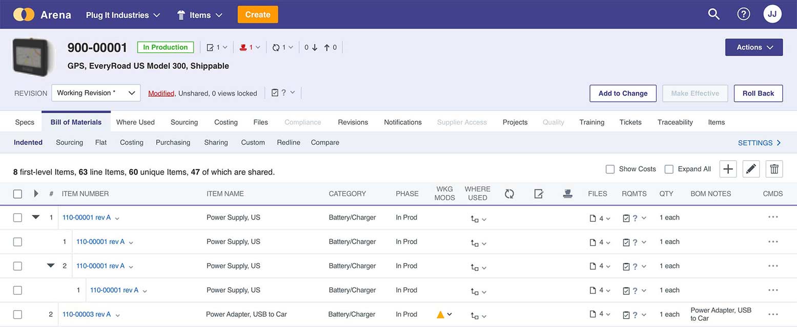
The same principle is carried through on tables. The headers have different shading than data, so you can focus on the elements you need, in order.
Jannelle: In addition to using color in a balanced way, we consolidated the buttons. This make the user’s eye go to that important, weighted area as they scan the page. Each page looks cleaner.


Emphasis
Definition: Provides visual hierarchy and clear viewing order.
Ann: How does emphasis fit into the design?
Antony: Like most enterprise apps, the core of Arena is data. Emphasis works together with balance to provide focus. We emphasize the more important information like object identifiers—for example, Number or Title—so users can see right away what they’re looking at, then shift to reference data like related changes, training plans, or other items all in one view.
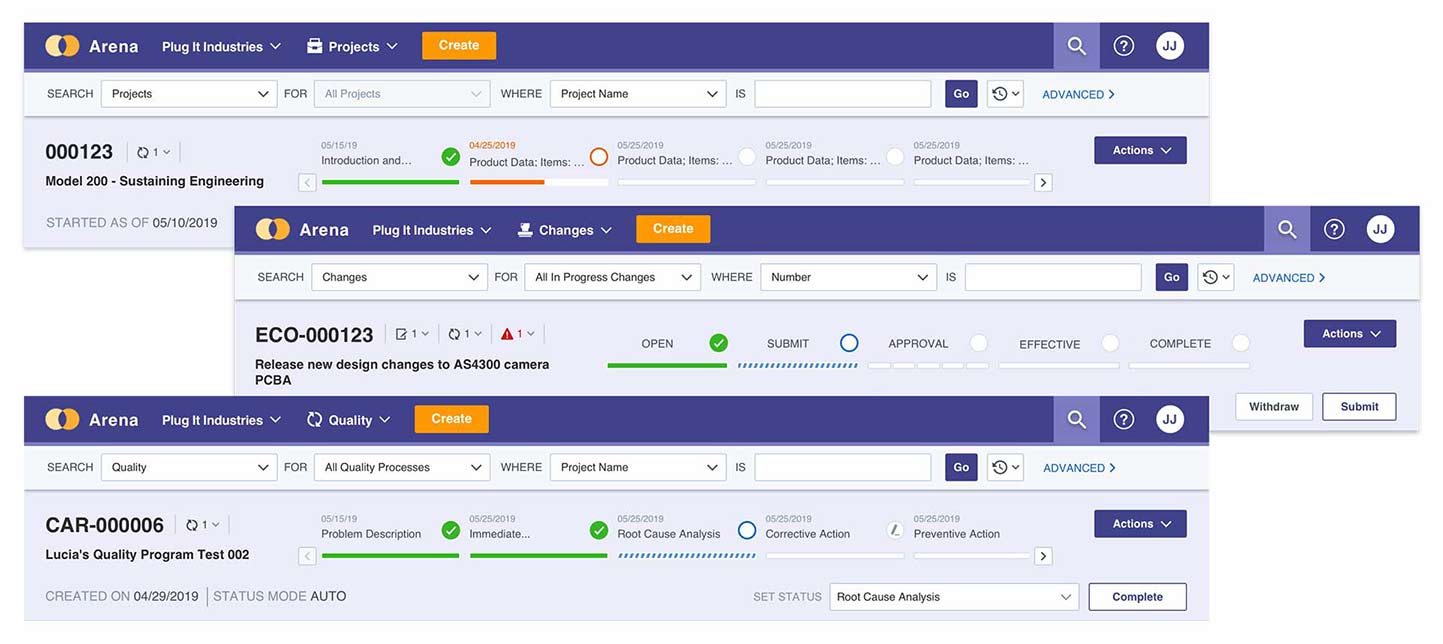
Jannelle: Even casual users should be able to follow the structure of information as it’s presented. The user should see a summary of the object opened. Emphasis is first on the item opened, then the details follow. For example, when you need to know the status of a change, first you confirm the change is the one you want (change number and description), then you see the status.
Ann: How did you achieve emphasis in this refreshed design of Arena?
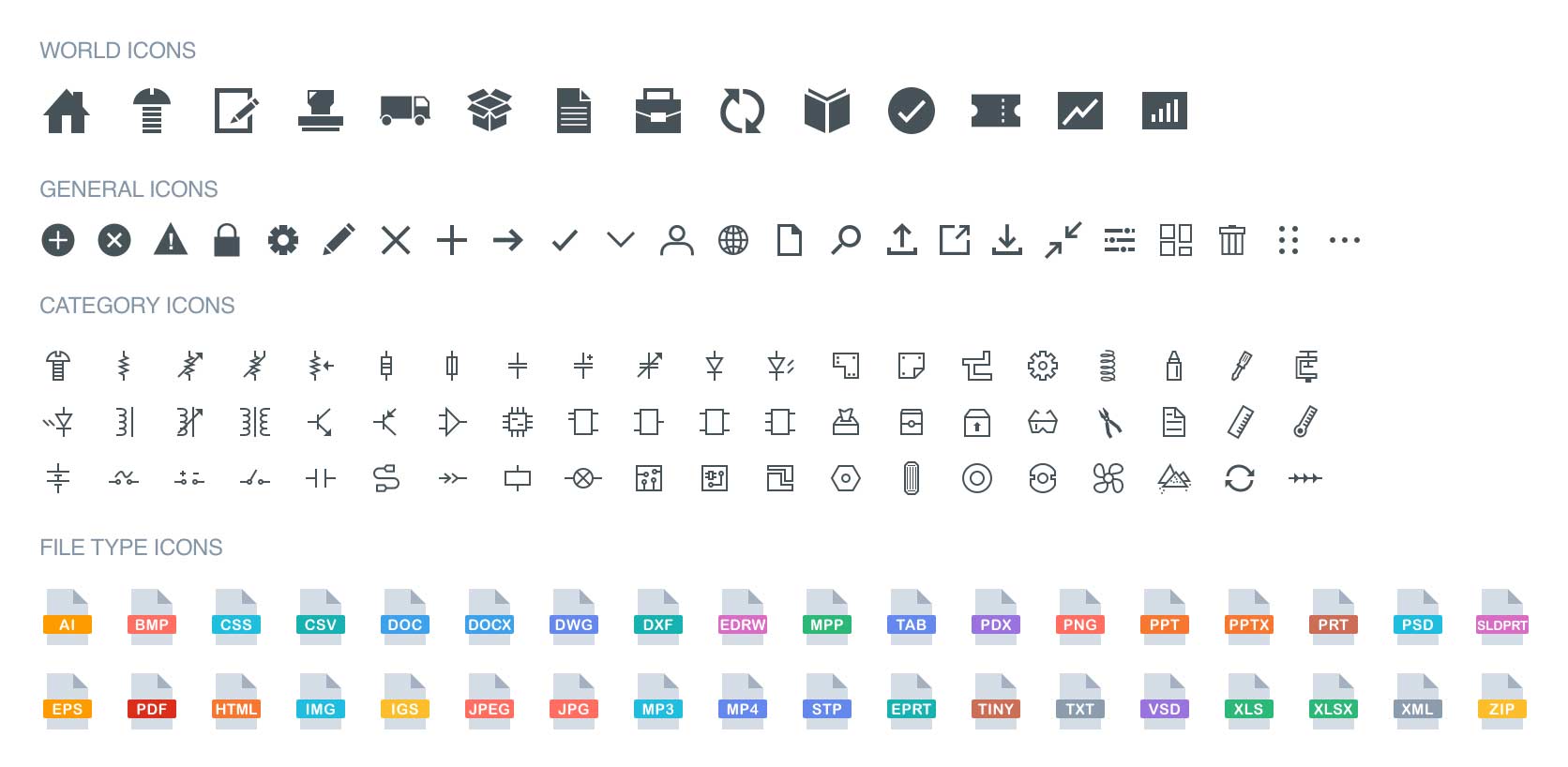
Jannelle: We emphasized in a variety of ways, such as higher contrast, more color, and larger size. We added emphasis to messages that confirm an action was completed, or met an error by using color coded message categories and icons.
Antony: Creating that separation, layout, and organization draws you to the most important information on the page. On an engineering change or product-related project, the header draws your attention. This is the first thing you want to see. As you’re traversing and scanning from top to bottom, you can quickly and easily see what’s the most important information.

Repetition
Definition: Unifies and reinforces ideas.
Ann: Why does repetition matter?
Antony: Consistency. Repetition provides consistency, which reduces user training and enables casual users. Any good UI should have repetition to take advantage of our how our brains learn, our muscle memory. Any skill we develop improves with repetition: driving, swimming, gaming, and so on, because our brains develop a rhythm. It becomes your second nature, automatic.
In UIs, repetition unifies elements for familiarity. It reduces training when adding new users or expanding functionality.
Jannelle: Repeating elements helps the users identify our software quickly. This helps new or casual users. And, as you expand your system, your users will adopt it more easily.
Ann: How does Arena do repetition?
Jannelle: We used familiar elements, like badges and progress bars. Each element is consistent throughout the application and with your other current software experiences.

Antony: We implemented the same behaviors and actions throughout the application.
And, anytime we put a new element on the screen, we evaluate the other elements to make sure they are in the proper place to provide an experience that users are familiar within our application.

Ann: So, tell us what’s next?
Jannelle: UI and design trends are constantly changing. We built this to last, but we have ideas for the future. We are also listening to customers for input. This change is part of something bigger. The refreshed UI is a good foundation for addressing UX.
Our mantra for this release was “simple, easy, and refreshing.” Because it’s so familiar, you shouldn’t need retraining.
Antony: This is only the start. We’re bringing you more improvements to make work easier and smarter. We’re evaluating processes to understand how to streamline them. We have a team focused on continually improving both UI and UX. UI is what you see, how you perceive it. UX is the experience you get out of the application as you interact with it.
Another factor we’re examining is how users are rewarded for interactions. We all use smartphone apps that immediately reward us as we use them. Back to our brains: Our brains like these rewards. How can Arena reward users effectively as we’re releasing changes or bringing a new product to market?
This updated Arena UI gives you better ways to get things done. We hope Arena users take some time to preview the changes, then enjoy this refresh. We want you to know we are continually working to improve Arena for you.

Jannelle Jansen
Jannelle is a User Experience and User Interface Designer with Arena. She’s passionate about optimizing digital systems for enhanced efficiency, balance, and feasibility. She works on the project management team at Arena and is excited to continue to enhance Arena with her UI and UX expertise.

Antony John
Antony, Director of Product Management at Arena, leads the product strategy and direction of Arena and the Empower suite of products. He has over 15 years of experience leading PLM software teams and is passionate about user interface and user experience.


